
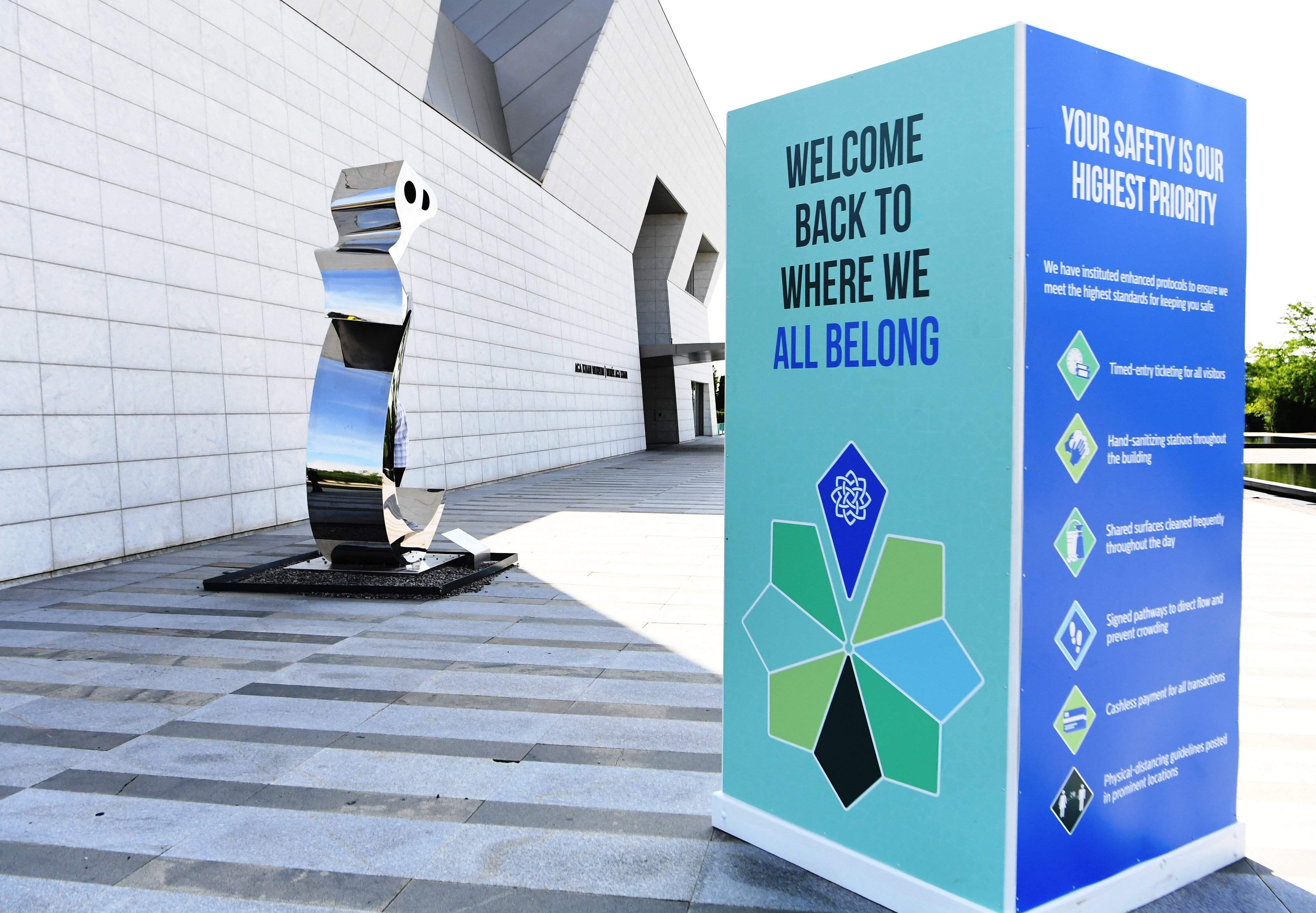
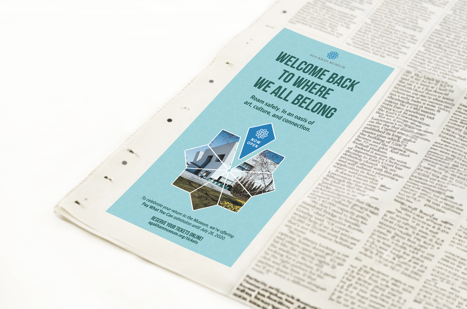
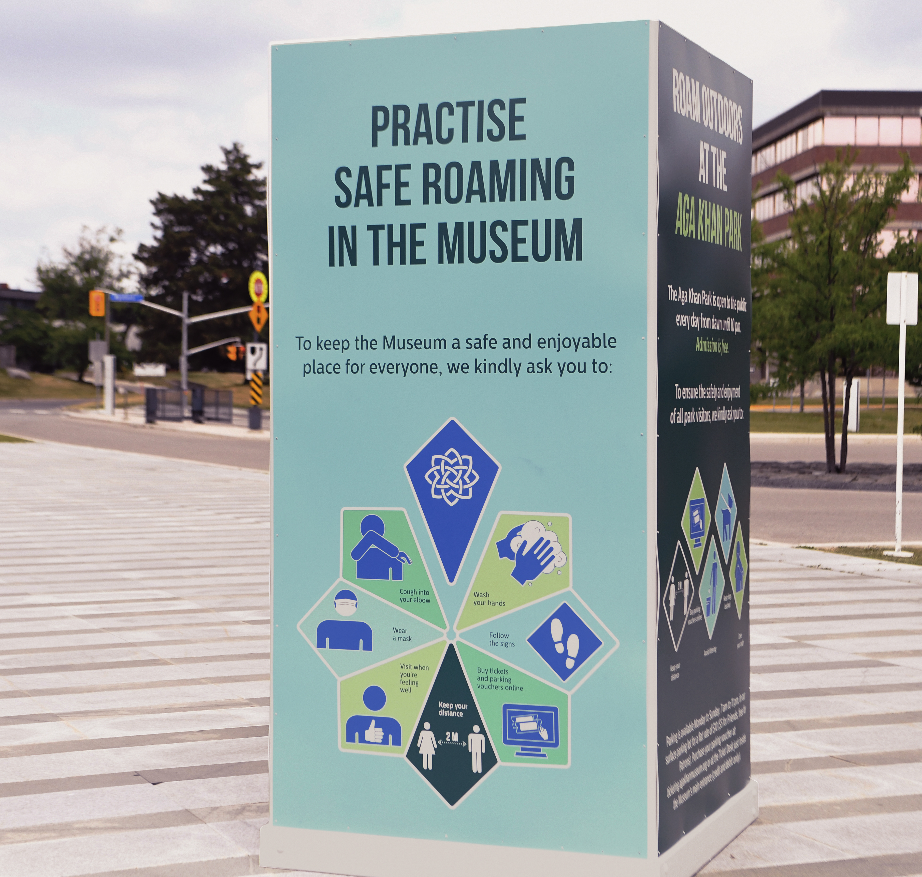
3 months of lock down. Feelings of isolation, uncertainty and boredom were palpable in Toronto. The Aga Khan Museum received the news that it was time to reopen to the public. The biggest challenge was to develop a campaign that promoted safety, security, and inclusivity. With these goals in mind, I searched the Museum’s design archives for the perfect unifying symbol. Hiding in the geometric patterns used throughout the Museum was the shape I had been looking for. It consisted of eight segments. On their own, the segments were simple teardrops, but combined they formed a complicated, yet beautifully symmetrical star. The symbolism of the star; a shape with no beginning or end, comprised of individual pieces that joined to form a whole, became the unifying symbol for the Museum’s reopening campaign.


RESPONSIBILITIES:
BRANDING: Applying brand guidelines to campaign creative.
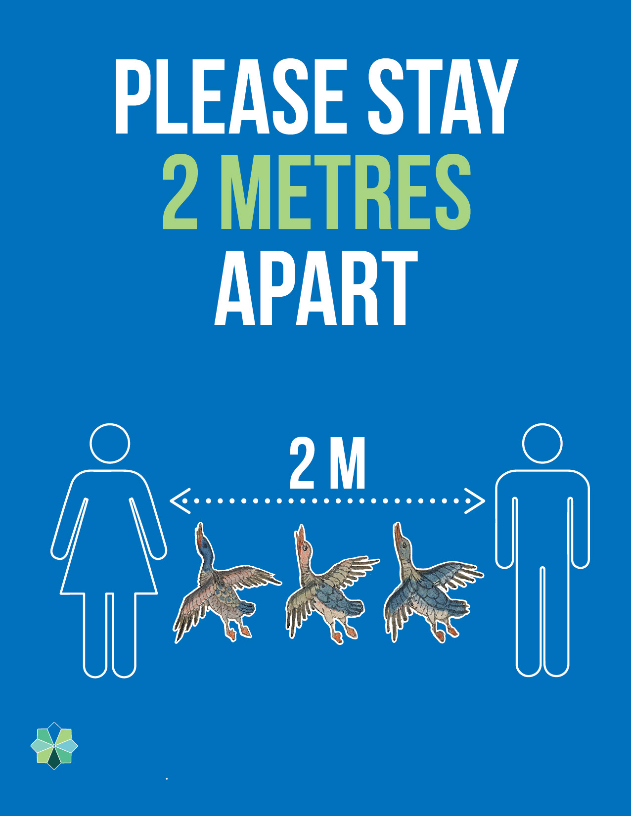
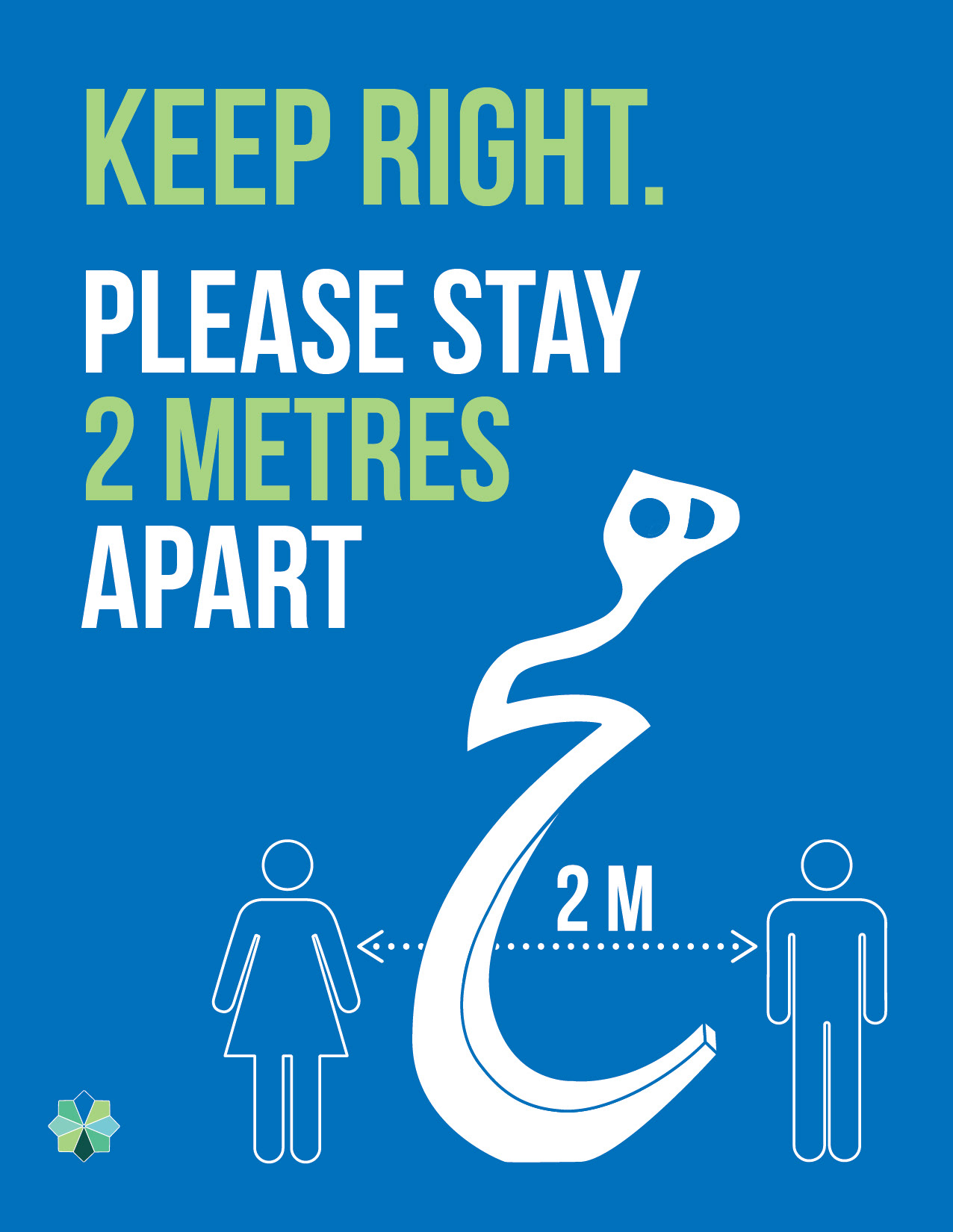
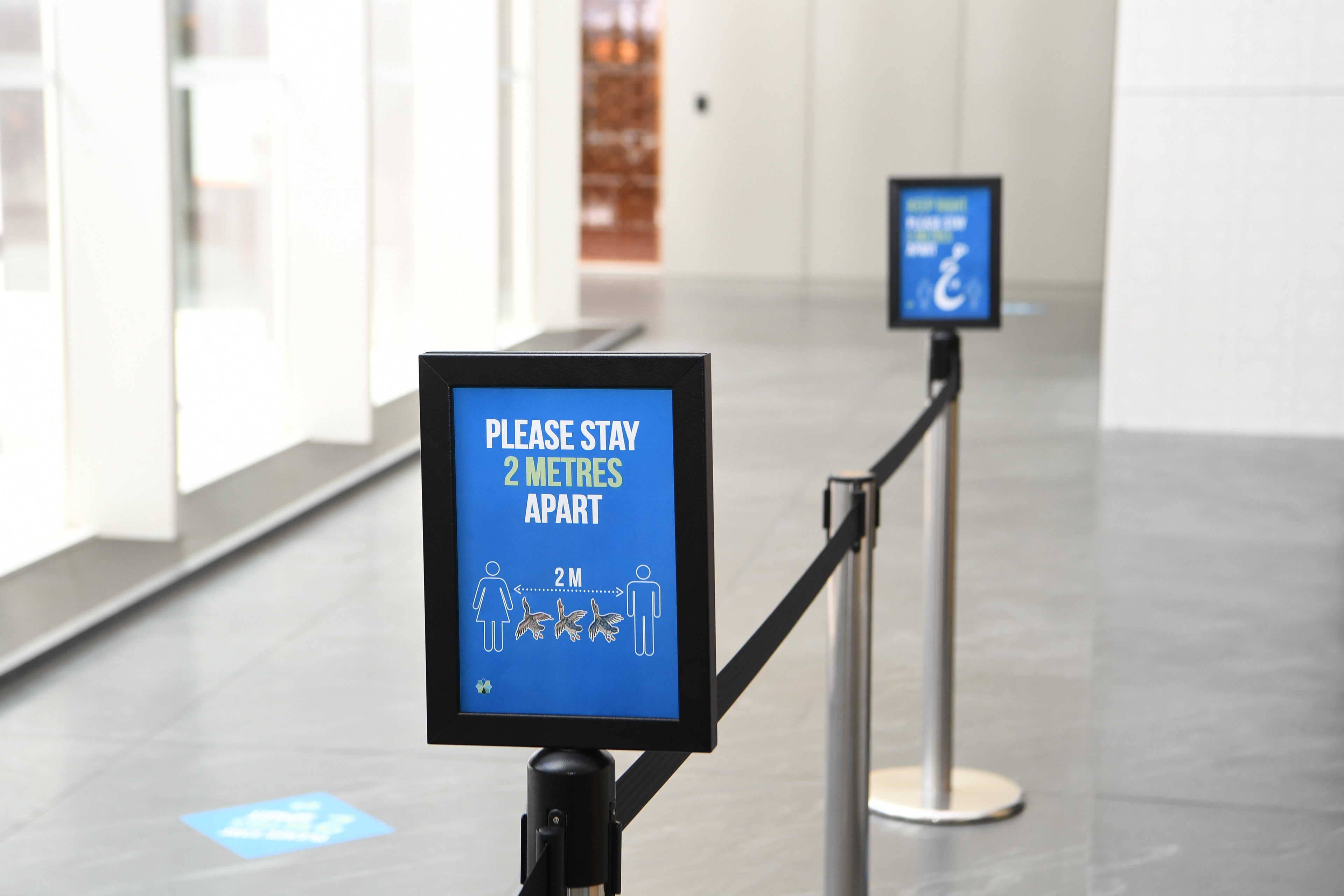
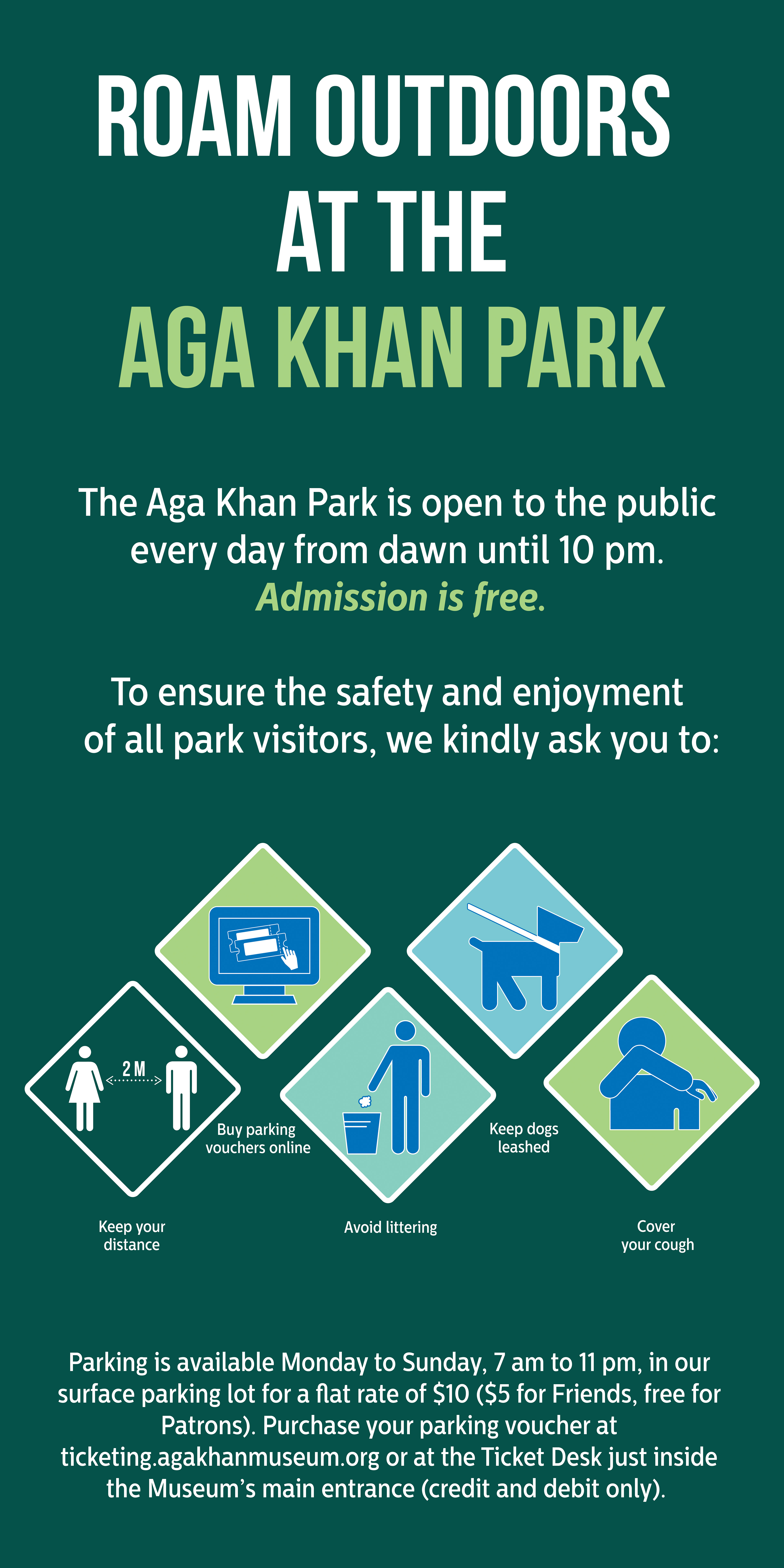
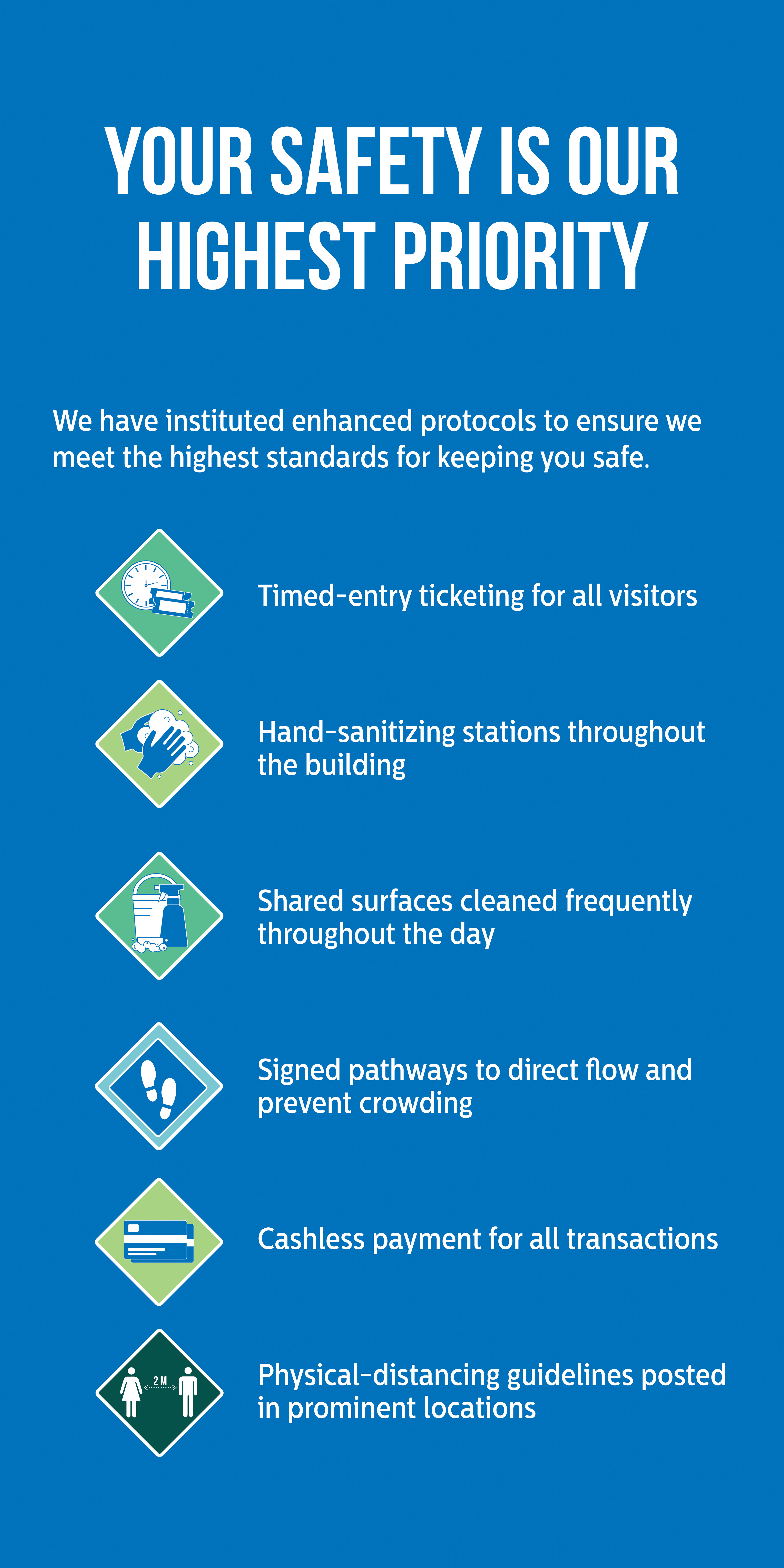
MARKETING: Campaign brainstorm; graphic/icon production; animation; print ads; digital ads; social media assets; interior signage; large-format exterior signage.
MARKETING: Campaign brainstorm; graphic/icon production; animation; print ads; digital ads; social media assets; interior signage; large-format exterior signage.